
- Festival Of The Mind (Designed by Human Studios)
Purpose
To advertise the festival - Festival Of The Mind. To bring people to the festival and help it to gain in popularity, hopefully to gain wider audiences and to bring people good times.
Target Audience
People interested in "Ideas, culture and collaborations". It has performances, talks, exhibitions and activities. So it really for anyone interested in arts and media.
Style
Style
It uses bright colours to draw you in and then uses a banner effect for the text against the white. The text is in capitals to stand out, its a like a sans serif font, looks like impact.The anchorage here is the word "Mind" is bigger than the rest and it is over the brain looking part of the head. The mode of address here is the 3D effect on the text it looks like there is only a white edge around the text but actually it looks like a 3D effect where the text goes off into the top left.
Format & Layout
The format for this is very central, the colours start of dark at either edge and slowly become brighter as the face s appear. With the text very central it makes you focus on all the central objects like the faces and the text. The part "Of the mind" is also quite small so that it does not cover the image up and it is more visible. Whereas the "Festival" and "Mind" is quite big because it is based where not much is going on the picture. It has a banner effect because of this.
Content
As well as the picture the image has other adverts on it for example Its has the university logo on it and sheffield city council logo. This will be to show the support behind the event and encourage people to come along.
This has no inappropriate content because it is not false advertising, it is a festival of the mind because its not only one thing that the festival does, so it is an expression of the mind.
Website - http://festivalofthemind.group.shef.ac.uk/

To advertise the event, to bring people along to the event, for people to have a good time and enjoy themselves and hopefully for their event to gain in popularity and gain wider audiences.
Target Audience
The audience is for anyone but the website says you should attend with an adult. There we be alcohol served so forms of ID will also be needed.
Style
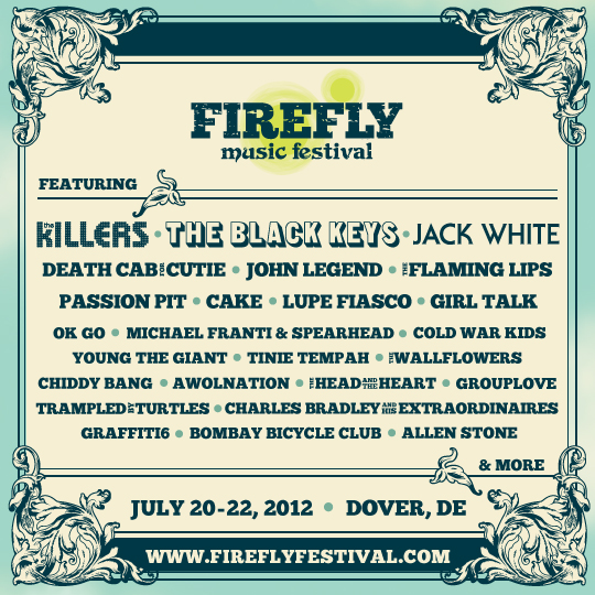
Very old style. Different shades of blue and white. Apart. Distinctive borders. Very informative style. The Firefly logo Centralised easily visible. All the text is capitals (Apart from the logo) Which is a striking look. The main three artists are in different fonts to make them stands. It has a banner effect too, the block capitals help with this too.
Format & Layout
Its not very centralised, but it keeps in a block shaped format and has distinctive borders. Sans serif font (like Impact).
Content
Includes distinctive borders and has a very old fashioned theme, the advert includes a website a date a place and a logo including a featuring artists list.
Does not break any code because it has no inappropriate content and is not misleading.
Website - http://fireflyfestival.com/
Format & Layout
The format for this is very central, the colours start of dark at either edge and slowly become brighter as the face s appear. With the text very central it makes you focus on all the central objects like the faces and the text. The part "Of the mind" is also quite small so that it does not cover the image up and it is more visible. Whereas the "Festival" and "Mind" is quite big because it is based where not much is going on the picture. It has a banner effect because of this.
Content
As well as the picture the image has other adverts on it for example Its has the university logo on it and sheffield city council logo. This will be to show the support behind the event and encourage people to come along.
This has no inappropriate content because it is not false advertising, it is a festival of the mind because its not only one thing that the festival does, so it is an expression of the mind.
Website - http://festivalofthemind.group.shef.ac.uk/
- Firefly Music Festival
Purpose
Target Audience
The audience is for anyone but the website says you should attend with an adult. There we be alcohol served so forms of ID will also be needed.
Style
Very old style. Different shades of blue and white. Apart. Distinctive borders. Very informative style. The Firefly logo Centralised easily visible. All the text is capitals (Apart from the logo) Which is a striking look. The main three artists are in different fonts to make them stands. It has a banner effect too, the block capitals help with this too.
Format & Layout
Its not very centralised, but it keeps in a block shaped format and has distinctive borders. Sans serif font (like Impact).
Content
Includes distinctive borders and has a very old fashioned theme, the advert includes a website a date a place and a logo including a featuring artists list.
Does not break any code because it has no inappropriate content and is not misleading.
Website - http://fireflyfestival.com/
- Tramlines
Purpose
To advertise the tramlines event in 2012.
Target Audience
People who are fans of the facts, or generally like music and people looking for a good time, recommended that you are over 18 but if you are younger you need to attend with an adult
Style

Centralised style very blank around the outside and the start and end of the poster is very clear. There is a colour theme of pink/red to yellow and white font white and black are opposing colours to give a banner effect and it is also a serif font so it stands out more. There are also strap lines to help categorise the three columns below the headline. All the content is within the circle of images, but a first looks like a semi-circle as the circle is quiet oval and the pictures are very faint.
Format and Layout
The poster is very centralised all content is within the circle of images. The title is very central to a is very distinctive due to the big white bars covering the title. All other supporting text is below the title in quite small font. This will be because this is information you will look at when you have been looking at it for about a minute or so, rather than looking at it in a car for roughly 4 seconds.
Content
It has the location of the events on the days, it has all the sponsor and images to advertise the event.
Does not break any code because it has no inappropriate content and is not misleading.
Website - http://www.tramlines.org.uk/

Very tight and compact. The red blocks show the dates of the events. Then the text next to it is the artists who are playing on those days. Then at the bottom is the title of the event and location details. Most of the poster is in block capitals making it stand out. The problem with this poster is it quite hard to navigate (at first). However it is nicely divided and the titles are nicely formatted. The main advertising point of this poster is the artists. Unlike the mosborough its title doesn't cover most of the page, instead it is at the very bottom in roughly the same sized font as some of the artists names.
Target Audience
People who are fans of the facts, or generally like music and people looking for a good time, recommended that you are over 18 but if you are younger you need to attend with an adult
Style

Centralised style very blank around the outside and the start and end of the poster is very clear. There is a colour theme of pink/red to yellow and white font white and black are opposing colours to give a banner effect and it is also a serif font so it stands out more. There are also strap lines to help categorise the three columns below the headline. All the content is within the circle of images, but a first looks like a semi-circle as the circle is quiet oval and the pictures are very faint.
Format and Layout
The poster is very centralised all content is within the circle of images. The title is very central to a is very distinctive due to the big white bars covering the title. All other supporting text is below the title in quite small font. This will be because this is information you will look at when you have been looking at it for about a minute or so, rather than looking at it in a car for roughly 4 seconds.
Content
It has the location of the events on the days, it has all the sponsor and images to advertise the event.
Does not break any code because it has no inappropriate content and is not misleading.
Website - http://www.tramlines.org.uk/
- Mosbrough festival
Purpose
To advertise the music festival "Mosborough Music Festival". Hopefully to get people to come along and enjoy the event etc, for them to earn money of this.
Target Audience

People who are fans of music or the bands performing, the event is for all ages. "We have a Child welfare officer on site and a welfare point to meet in case you get split up from loved ones, a regular announcement will be made over the PA system." Drinks will be available so ID will be required.
Style
The title covers roughly half the poster and is bright yellow/gold (Does fade outwards), so obviously the main message the producers want to get across is that there is a music festival coming soon in Mosborough". The rest of the poster is Yellows, whites and reds. Colours which all have banner effects on the background as it is quite a dark background with different shades of blue and towards the bottom of the page white,yellows and greens to build up various swirl effects and and silhouette of a crowd. The style is quite simple in the fact that the layout and text is very plain and straight to the point (Quite serif).
Format And Layout
Everything on this poster is focused on the bright, bold text. It has all the other information below. It has all artists on the left hand side and all information like tickets etc on the right. So the format is nice and simple and easy to read. It has the location and times right below the title so you can easily get all the details from the poster easily.
Content
It includes all artists, website (& E-mail), date and times, Qr code, several supporting companies (Haybrook etc), ticket prices.
Does not break any code because it has no inappropriate content and is not misleading.
Website - http://www.mosboroughmusicfestival.co.uk/mmf/
Does not break any code because it has no inappropriate content and is not misleading.
Website - http://www.mosboroughmusicfestival.co.uk/mmf/
- Resistanz Music Festival Poster
Purpose
To advertise the music festival Resistanz and the bands that will be playing there.
To advertise the music festival Resistanz and the bands that will be playing there.
Target Audience

People who are into industrial and electronic music. Or are interested in the event and are looking for new experiences.
People who are into industrial and electronic music. Or are interested in the event and are looking for new experiences.
Style
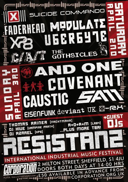
Sticks to a house style of reds, whites and blacks. It gives a very industrial look to it. For example the border looks like chains surrounding the edge. It almost has a Russian theme to it, with the reds and block of colours instead of various shades of colour. Also had an interesting way of presenting artists, so some populate most of the poster in big fonts, then others in quite small fonts that aren't as visible as the others.
Format And Layout
Very tight and compact. The red blocks show the dates of the events. Then the text next to it is the artists who are playing on those days. Then at the bottom is the title of the event and location details. Most of the poster is in block capitals making it stand out. The problem with this poster is it quite hard to navigate (at first). However it is nicely divided and the titles are nicely formatted. The main advertising point of this poster is the artists. Unlike the mosborough its title doesn't cover most of the page, instead it is at the very bottom in roughly the same sized font as some of the artists names.
Content
Includes dates that the certain artists are playing. Includes a time that the event starts and the location of the event.
Does not have any misleading points. Does not break any codes.
Website - http://www.corporation.org.uk/resistanzfestival/
Includes dates that the certain artists are playing. Includes a time that the event starts and the location of the event.
Does not have any misleading points. Does not break any codes.
Website - http://www.corporation.org.uk/resistanzfestival/
No comments:
Post a Comment